
How to Use Reference Frames in a Film or Commercial Pitch Deck
Image source: Best film stills websites & databases for creatives (2026)
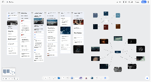
Image source: Film Pitch Deck - Build Your Pitch on One Canvas - Storyflow

Image source: Master the Art of Film Lookbooks: What to Include and How to …
Reference frames work best in a film or commercial pitch deck when each one makes a specific creative decision visible—not just when it looks good. Use them to show the intended framing, light, color, production design, or emotional tone, then explain briefly what would carry into the project and what would be different. 1, 2
Choose frames with a job
Start with the script or concept, not an image search. Pick the moments a reader most needs to imagine: the opening impression, a key character or product reveal, a change in mood, and the ending. For each, choose a frame that demonstrates one clear intention. A film deck might emphasize character perspective and the visual progression of the story; a commercial treatment might emphasize how the product is seen and how the visual approach serves the idea. Lookbooks commonly group references around cinematography, color, locations, and character or costume. 3, 4
The most useful reference frame usually answers one of four questions: Where is the camera? What does the light do? How does the color behave? What feeling should the viewer have? A wide static frame can communicate isolation or scale, while a tight, off-center close-up can suggest pressure or intimacy. A frame with hard overhead light tells a different story than one with soft window light, even if the composition is similar. In a pitch deck, that difference is more important than whether the image is famous or visually striking.
Caption the reason, not just the source. For example:
Reference: side-lit close-up. The face should emerge gradually from shadow, but the camera stays still so the reveal feels deliberate.
That tells a director, client, or producer what to discuss and helps prevent the reference from reading as a request to copy the shot. Short, purposeful captions alongside images are more useful than an unexplained collage. 2, 5
When several frames appear on one page, keep them speaking the same visual language. If one page is about “harsh daylight realism,” do not mix in a glossy backlit beauty shot unless the contrast is intentional and explained. A reference page should feel curated, not accumulated.
Build a visual chain, not a mood dump
A strong deck usually moves from broad to specific: concept, visual tone, then scene or shot references. That order helps the reader understand why each image appears. A few well-chosen frames are more persuasive than a wall of imagery, because the deck feels designed rather than assembled.
Use different reference types for different jobs:
- Film stills are strongest for composition, blocking, and scene mood.
- Photography can better isolate lighting, wardrobe, or texture.
- Product stills or tabletop references help in commercials where surface, reflection, and scale matter.
- Sketches or frames from tests show that the look is being built for the project rather than borrowed wholesale.
If movement or editing rhythm is the point, a still is often not enough. In that case, note the camera motion, lensing, or pacing you mean: a slow push-in, a handheld drift, a locked-off tableau, a snap zoom, or a cut pattern that builds energy. A frame alone cannot explain a sequence of reveals, so the caption has to do more work.
Keep the deck coherent
Give the reader a path from the premise to the visual world: establish the idea, show a small set of references for its defining moments, then state the intended approach. Keep the frames legible, label their purpose consistently, and remove references that point toward a different-looking project. If movement or editing rhythm is the point, a still may be insufficient; identify the clip and the particular motion or pacing meant. 2, 5, 6
A useful deck usually makes one aesthetic argument at a time. If the project is meant to feel intimate and contemporary, avoid stacking references that are all epic, glossy, or highly stylized. If the aim is a polished commercial look, do not dilute it with too many gritty documentary frames unless that tension is deliberate. Consistency matters because clients and collaborators read a deck as a promise of tone as much as a promise of story.
Avoid letting an existing film become the entire visual identity of the pitch. Mixing film frames with photography, location research, sketches, or original tests can make the proposal feel more specific to the project rather than derivative. 3, 7 That mix also helps communicate what is being referenced structurally rather than copied literally. A single movie still can suggest contrast, color, or camera distance; the rest of the deck should explain how those qualities translate into a new production.
For commercial work, the product should remain visually central. Reference frames should clarify where the brand lives in the image, how much negative space is needed for copy or supers, and whether the camera treats the product as a hero object, part of a lifestyle scene, or an expressive detail. For narrative work, the references should support character, setting, and arc, not flatten everything into a generalized “cinematic” look.
Check usage rights
A reference frame is not automatically cleared because it appears in a private pitch, is credited, or comes from a stills database. In Germany, the quotation exception under § 51 UrhG depends on a genuine quotation purpose and an amount justified by that purpose; using an image merely as decoration is not necessarily covered. Record each image’s source and rights status, and seek permission or use appropriately licensed or original material where the deck will be distributed publicly or the image will appear in final advertising. 8, 9, 10
That caution matters across the EU as well: quotation exceptions are narrow, and the reference must be tied to a real explanatory purpose rather than used as a decorative mood image. A pitch deck is safest when the image use is clearly analytical, limited to what the concept needs, and supported by original material wherever possible. When a deck is shared widely with agencies, brands, or potential investors, a rights review is part of production, not an afterthought.
A practical workflow is simple:
- track each frame’s source,
- note whether it is a film still, photo, test frame, or original image,
- record the intended use in the deck,
- and remove anything whose rights status is uncertain before external distribution.
That process keeps the deck focused on creative intent instead of copyright risk, and it makes the visual references easier to trust in a professional pitch setting.
References
-
Film Pitch Deck - Build Your Pitch on One Canvas - Storyflow
-
Master the Art of Film Lookbooks: What to Include and How to …
-
How to Write a Film Pitch Deck in 2026 (Step-by-Step) | Storyflow
-
Gesetz über Urheberrecht und verwandte Schutzrechte (Urheberrechtsgesetz)§ 51 Zitate
-
Film stills database: search 2 million cinematic frames | Flim