Unravelling the Visual Language of Classic Genres: From Westerns to Noir and Sci-Fi
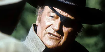
Image source: How Did the Close-Up Change the Way We View Westerns?
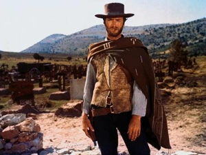
Image source: Western | Aesthetics Wiki - Fandom
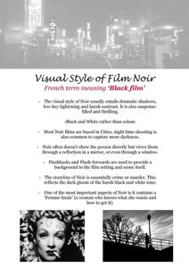
Image source: Visual style of film noir | DOCX - Slideshare
The visual language of classic westerns, noir, and sci-fi relies on distinct cinematographic techniques, color palettes, and iconic motifs that instantly signal each genre to audiences. In practice, each one is built from a repeatable combination of framing, lighting, lensing, and production design: westerns open the frame, noir compresses it into shadow, and sci-fi alternates between clinical precision and speculative spectacle.
🤠 Western: Expansive Freedom & Rugged Isolation
| Dimension | Visual Characteristics |
|---|---|
| Shots | Sweeping wide shots capturing vast deserts, mountains, and open plains; the landscape acts as a character itself 1, 2 |
| Color/Lighting | Sepia-toned or desaturated earth colors; high-contrast lighting emphasizing starkness; warm earth tones and sunset colors 1, 3 |
| Motifs | Cowboy hats, six-shooters, horses, cattle, cactuses, tumbleweeds, stagecoaches, saloons, frontier towns 4 |
| Mood | Isolation, self-reliance, moral clarity (or ambiguity), wildness 1, 4 |
Classic western cinematography is built around distance. The camera often holds a figure small against an enormous horizon so that land, weather, and light define the drama as much as the characters do. That scale is not just decorative: it turns the frontier into a test of endurance, and it lets the audience read physical movement as narrative progress.
The most recognizable western look comes from hard sunlight, deep shadows, and practical skies. Midday exteriors often favor a crisp, unforgiving contrast, while late-afternoon and sunset setups bring out amber tones that soften the violence of the environment. Color design usually stays close to dust, leather, wood, and dry brush, so even when the image is saturated, it feels weathered rather than glossy.
Lens choice reinforces the genre’s spatial logic. Wider lenses preserve the relationship between rider and landscape, while carefully placed close-ups land harder because they arrive after long stretches of distance. When the film wants tension, the frame narrows around doorways, hitching posts, saloon thresholds, and street crossings, creating a visual rhythm of exposure and cover.
A western also depends on iconography that can be read in a single shot. A lone figure on horseback, a porch silhouette at dusk, or a dusty main street immediately establishes frontier rules: honor, territory, survival, and social order under strain. The genre’s visual power comes from how clearly it separates the open world outside from the controlled spaces inside town.
🌃 Noir: Shadows & Moral Ambiguity
| Dimension | Visual Characteristics |
|---|---|
| Lighting | Chiaroscuro (dramatic light/dark contrast); low-key lighting with deep blacks, minimal fill, sharp key lights 5, 6 |
| Shots/Angles | Canted angles; extreme close-ups; asymmetrical framing; low camera angles; shadows that “trap” characters 5, 7 |
| Motifs | Venetian blind stripes, staircase shadows, cigarette smoke, wet streets, fog, silhouettes, reflections through windows 5, 6 |
| Color | Mostly black-and-white; occasional “bluish-smoky” exterior tones 5, 8 |
| Mood | Suspense, danger, psychological turmoil, moral ambiguity 5, 7 |
Noir is the genre of concealment. Instead of opening space, it slices it into fragments, blinds, corners, reflections, and partial silhouettes. Characters are often introduced through shadow before they are fully revealed, which gives the image a sense that the truth is always delayed or compromised.
Low-key lighting is central to that effect. Faces may be lit by a single hard source, with minimal fill letting eye sockets, cheekbones, and jawlines fall away into darkness. The result is a sculpted but unstable image: the viewer sees enough to understand the scene, but not enough to trust it. Wet pavement, glass partitions, and window blinds become especially useful because they break up light into patterns that feel both graphic and threatening.
Framing in noir tends to compress rather than expand. Canted angles create unease by making architecture feel unstable, while low angles can turn staircases, alleys, and office interiors into traps. The strongest noir compositions often place characters at the edge of the frame or behind foreground elements, suggesting entrapment and surveillance at the same time.
Although noir is strongly associated with black-and-white, the look is not simply monochrome for its own sake. The absence of color sharpens attention on contrast, texture, and form. Smoke, rain, reflective windows, and polished surfaces all become visual devices for uncertainty because they let the image split into layered planes instead of a single legible space.
🚀 Sci-Fi: Alien vs. Familiar & Futuristic Tech
| Dimension | Visual Characteristics |
|---|---|
| Color | White, blue, teal, silver, and neon/metallic hues; cool muted tones signaling technology 9, 10, 11 |
| Shots | Panning across cities/deserts; bird’s-eye views; establishing shots of spacecraft/space stations; wide majestic shots of alien worlds 10, 12 |
| Motifs | Spacecraft, space suits, robots, alien creatures, ray guns/lasers, futuristic gadgets, holographic displays, time machines 9, 10, 12 |
| Composition | Clash between alien and familiar images; asymmetrical designs; layered elements creating depth 12, 11 |
| Mood | Wonder, uncertainty about the future, technological advancement vs. human nature 10 |
Classic sci-fi visual language usually communicates two things at once: scale and difference. The audience needs to believe in a larger system than the one on screen, whether that system is a city, a spaceship, a laboratory, or an alien planet. That is why sci-fi frequently uses clean lines, controlled symmetry, and wide establishing views that make technology feel engineered rather than improvised.
The genre’s color palettes often lean cool because cool tones imply metal, distance, and scientific detachment. White interiors, blue highlights, teal fills, and silver surfaces make environments feel sanitized or advanced, while neon accents can suggest energy, warning, or artificial life. When the story wants wonder rather than sterility, the palette may broaden into saturated alien hues, but the image still tends to separate the natural from the manufactured.
Composition is where sci-fi becomes especially expressive. A tiny human figure against a massive machine, a corridor receding into hard perspective, or a landscape interrupted by an impossible structure all communicate the genre’s core tension: the future is both built and unfamiliar. That contrast often works best when one part of the frame feels recognizable and the other part feels radically transformed.
Practical motifs do a lot of the storytelling. A helmet visor, a blinking console, a holographic display, or a spacecraft hatch immediately tells the viewer how to read the scene. Even when effects are minimal, the genre can be established by production design that treats every surface as part of a system. Clean geometry suggests order; irregular alien forms suggest threat or awe.
How the Three Genres Separate Themselves Visually
The clearest difference between these classic genres is how they organize space.
- Westerns open the frame outward. The subject is often small, but the world feels physically navigable.
- Noir closes the frame inward. Space becomes obstructed by shadow, architecture, smoke, and reflection.
- Sci-fi builds the frame around designed systems. Space feels artificial, engineered, and often larger than human scale.
Lighting also separates them immediately. Westerns rely on readable natural light and harsh sun, noir depends on deep shadow and selective illumination, and sci-fi often uses controlled, cool, high-tech lighting to suggest machines, laboratories, or other worlds. A single exterior can even shift genre depending on treatment: the same street may feel like a western town at golden hour, a noir alley in rain, or a sci-fi colony if lit with blue practicals and metallic surfaces.
For filmmakers working in a genre framework, the most effective approach is consistency. The audience reads genre fastest when shot distance, contrast, color temperature, and production design all agree with each other. A western loses clarity if it is lit too softly and framed too tightly; noir weakens if every surface is evenly exposed; sci-fi feels generic when its surfaces, palette, and composition do not suggest a believable system.
Each genre uses visual cues to establish expectations: westerns celebrate expansive freedom, noir immerses the frame in shadowy psychological tension, and sci-fi explores the clash between alien futures and human familiarity.
References
-
From Western Frontiers to Digital Realms: The Evolution of …
-
Did Pulp Magazines Invent the Visual Language of 1950s Sci-Fi …
-
14 Top Sci-Fi Designs to Inspire Your Next Interface — SitePoint