
Film Emulation in Post: Recreating the Look of Film Stock
Image source: Split Tone
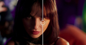
Image source: Blackmagic DaVinci Resolve 19 new Film Look Creator explained

Image source: Film Look Creator in DaVinci Resolve 21: complete Resolve FX …
Film emulation in post: recreating a film stock
Film emulation works best when film is treated as an image-making process, not a preset. The recognizable look comes from the interaction of exposure, negative color response, scanning or printing, and texture; a grain overlay alone cannot reproduce that chain. Kodak’s technical data describes a stock through separate sensitometric, spectral-sensitivity, sharpness, and granularity characteristics—not a single “film color.” 1
Choose the reference first
Decide whether the goal is to imitate a particular stock and finish or simply evoke film. “Kodak VISION3 50D” is a more useful target than “vintage”: Kodak describes 50D as a low-speed, daylight-balanced color negative with very fine grain and substantial highlight latitude. Even then, the final appearance depends on exposure, processing, scanning, and grading; Kodak notes that individual scenes are timed rather than expected to match one fixed print setting. 1
A strong reference set should match the kind of material being graded: interior versus exterior, hard sun versus soft overcast, skin tone complexity, and how saturated objects sit in the frame. A single glamour still or a beautifully lit sunset does not describe how the stock behaves across a scene. Film stocks are usually judged by how they hold faces, skies, foliage, and highlights together under different conditions, not by one hero frame.
Collect references that resemble the footage in lighting, lens character, and contrast. A sunlit exterior is a poor sole reference for a night interior, because a look must survive more than one shot. Colorist Cullen Kelly recommends checking look adjustments across the timeline rather than perfecting one isolated frame. 2
Build the look in layers
flowchart LR A["Camera footage"] --> B["Input transform / color management"] B --> C["Shot balance and matching"] C --> D["Negative-inspired tone and color"] D --> E["Print or scan rendering"] E --> F["Halation and bloom"] F --> G["Output transform and final texture check"]A film-emulation grade is easiest to control when each layer has one job. The most common failure is stacking several “film” operations at once, then trying to fix the damage with more film tools.
- Normalize the source. Interpret RAW or log footage with the correct input transform and work in a consistent grading space. Do not apply a LUT intended for one camera encoding to unrelated footage and expect a reliable stock match. Kelly’s Resolve workflow transforms camera material into a common wide-gamut working space before creative look development, then transforms it for display. 2
- Balance shots before styling them. Set exposure and white balance, then match shots in a scene. Keep these corrections separate from the shared film look so a warm practical in one shot does not force the entire emulation to compensate. A good stock imitation starts with clean matching, because film stocks were never valued for hiding exposure errors.
- Shape tone and color. Build a gentle shadow toe, controlled midtone contrast, and a highlight shoulder rather than indiscriminately crushing blacks and clipping whites. Refine hue and saturation relationships—especially skin, foliage, skies, and intense colors—against the reference. Kodak’s characteristic curves show that a negative’s red, green, and blue density responses vary with exposure, which is why a simple contrast curve is only part of a stock imitation. 1
- Choose the finishing interpretation. A negative scan and a projected print are different targets. If a print-emulation LUT is used, verify what input it expects and avoid stacking it blindly on another display transform. Keep the look adjustable so bright signs or saturated objects can be checked before they flatten or clip; Kelly specifically cautions that a look can appear sound on many shots before failing on an unusual color. 2
- Add texture selectively. Halation is a restrained glow close to bright edges; bloom is a broader softening of bright areas. Grain should have a believable size and strength at the final viewing size. Kodak notes that perceived grain depends on scene content, density, exposure, processing, and transfer—not just a universal grain setting. 1, 2
What actually makes film feel like film
The film impression usually comes from three things working together: a curved tonal response, a controlled color separation, and texture that follows image density. Digital footage often looks “filmic” only when those parts agree. If the contrast curve is vintage but the color remains hyper-clean, or if the grain is heavy but the highlights are still razor-bright and clinical, the result reads as an effect rather than a stock.
Halation is especially easy to overdo. In real film, the glow around practicals and speculars is usually subtle and localized, more visible around small bright sources than across the whole frame. Bloom behaves differently: it softens a wider area and can make highlights feel airy or diffusion-heavy. Mixing the two without restraint quickly pushes the image away from a convincing scan.
A practical Resolve starting point
In DaVinci Resolve, keep input normalization, shot corrections, the shared look, and output rendering conceptually separate. Film Look Creator provides controls for contrast-related styling, subtractive saturation, split tone, halation, bloom, and grain; Blackmagic lists those as distinct components, and Kelly suggests starting with contrast and subtractive saturation rather than moving every slider at once. Judge the result across several shots, then add only the texture the reference actually shows. 2, 3
A practical order is: normalize, balance, create the tonal shape, adjust color separation, then add halation and grain last. That sequence mirrors how the eye reads filmic images: the tonal envelope is noticed before the texture. Grain laid down too early can also make it harder to judge whether the color and contrast are right.
The most useful test is to compare the grade with texture disabled. If removing grain destroys the entire “film look,” the tone and color work need more attention. If enabling the look damages skin, clouds, or saturated highlights, reduce or revise that part before adding more effects. Film emulation can evoke a stock convincingly, but it cannot restore highlight detail or color information that the original digital capture never recorded.
Matching a specific stock versus evoking film
A specific stock match is constrained by the material’s published behavior: speed, color balance, grain structure, and latitude. A general film evocation is looser and can borrow only the broad traits—softer highlight roll-off, gentler saturation, a denser toe, and natural-looking texture. The more exact the target, the more the grade has to respect the stock’s characteristic response instead of simply chasing mood.
That distinction matters in practice. A daylight-balanced stock like VISION3 50D suggests one family of response; tungsten-balanced stocks, reversal stocks, and push-processed negatives all behave differently. “Film look” is therefore a spectrum, not a single preset style. The cleanest results usually come from deciding which part of that spectrum is being imitated before any creative grading begins.
Common mistakes
- Using grain to fake everything. Grain cannot substitute for tone mapping, color separation, or highlight behavior.
- Stacking transforms blindly. A camera LUT, a show LUT, and a film-emulation LUT can each be correct in isolation and wrong together.
- Forcing one shot to define the whole look. Film stocks are judged over sequences, not single frames.
- Overdoing halation and bloom. Small practicals should feel organic, not surrounded by a visible effect ring.
- Ignoring the viewing size. Grain that feels subtle on a reference monitor can become coarse on a large projection or online compression.
What to preserve from the original capture
Film emulation works best when the digital source is already well photographed. Proper exposure, controlled highlight clipping, and clean white balance give the emulation room to behave like a stock instead of a rescue tool. If the image is severely underexposed, noisy, or color-mixed beyond repair, the grade can only approximate film’s surface qualities, not its underlying photographic response.
The strongest results come from treating the grade like a print pipeline: normalize the source, match the shot, shape the negative, then finish with texture. That order keeps the look coherent and makes the stock feel built into the image rather than pasted on top.