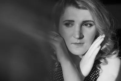
Using Negative Fill to Shape Contrast: Practical Lighting Control for Cinematic Depth
Image source: Negative Fill: Shaping Shadows | BOLD University
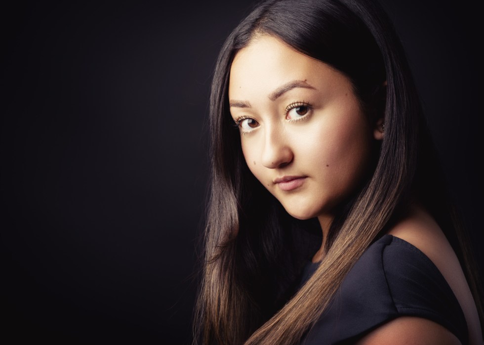
Image source: The Portrait Photography Glossary
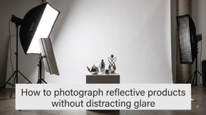
Image source: How to Photograph Reflective Products Without Distracting …
Using negative fill to shape contrast
Negative fill makes a subject look more dimensional by reducing light on its shadow side, rather than adding light to the bright side. A black panel absorbs or interrupts light bouncing back from walls, floors, or the sky; the lit side stays much the same while the shadow side darkens. 1, 2
flowchart LR A[Key light illuminates subject] --> B[Nearby surfaces bounce light into shadows] B --> C[Shadow side looks brighter and flatter] D[Black panel placed on shadow side] --> E[Less bounce reaches subject] E --> F[Deeper shadows reveal shape and increase contrast]Why negative fill works
A face, a wardrobe, or a product often looks flatter when too much stray light lifts the shadows. Negative fill restores modeling by subtracting that fill, which increases local contrast without changing the key light itself. In practice, it acts like a controllable shadow-making tool.
That distinction matters because contrast is not only about brightness; it is also about separation between the lit and unlit planes of the subject. When the shadow side drops, the cheekbone reads more clearly, the jaw gains volume, and fabric texture becomes easier to see. The result is usually more directional and cinematic, especially in rooms with white walls, pale ceilings, or reflective floors.
Negative fill is most effective when the scene already has some bounce to remove. In a dark studio with little ambient spill, a black cloth may do almost nothing. In a bright kitchen, white living room, or daylight interior, the same cloth can noticeably deepen the shadow side.
Set it up
- Establish your key light—such as a window or softbox—and notice which side of the subject is in shadow. 1
- Put a matte black foam board, black-sided reflector, V-flat, or black fabric on that shadow side, just outside the frame. Aim to intercept the surrounding bounce without blocking the key light. 2, 3
- Move the panel closer for a stronger effect or farther away for a subtler one. Watch the cheek, jaw, and eye area rather than trying to make every shadow as dark as possible. 1, 2
- Compare shots with and without the panel while keeping the pose, key light, camera, and exposure fixed. If little changes, reposition the panel; there may also be too little bounce to subtract. 2
For a window-lit portrait, try the window on one side of the face and a black board on the other. The board can keep a bright room from filling in the shadow cheek, making the face’s planes easier to read. Negative fill changes shadow depth, not the softness of the shadow edge; that softness depends primarily on the apparent size of the key light. 2, 3
Common ways to use it
Portraits
Negative fill is a fast way to sculpt a face in broad daylight or on a soft key. A black card placed near the cheek, temple, or jaw can create a stronger hollow under the cheekbone and a cleaner separation along the nose and chin. In profile or three-quarter angles, it can also stop the near side of the face from glowing too evenly.
For beauty work, the effect is usually subtle. For drama, the panel can be brought closer and used more aggressively to push the eye sockets, under-cheek, and neck into darker tone. The best placement is often just outside frame on the shadow side, aligned with the part of the face that needs the most shape.
Half-length and full-body shots
On a wider frame, negative fill is not only about faces. A black frame edge, duvetyne skirt, or large V-flat can keep a blouse, jacket, or arm from being washed in by room bounce. This helps separate the subject from a bright wall while preserving the overall direction of the key.
Costume also responds well to subtraction. Black suits, dark denim, and textured materials often gain depth when the fill is reduced, while glossy fabrics and skin highlights stay more readable because the key remains intact. The goal is controlled contrast, not an evenly dark frame.
Products and tabletop setups
On reflective products, negative fill can define shape by creating darker edges in the reflection. A bottle, phone, or watch often needs a black surface nearby to give the viewer something to read against the highlights. Without it, the object can merge into a high-key environment and lose contour.
The same principle applies to tabletop food and still life: a black card on one side can keep steam, glaze, or edge highlights from being surrounded by too much ambient light. This is especially useful when the setup includes a large overhead soft source that makes everything look uniformly lit.
Negative fill versus a reflector
A white reflector and a black panel do opposite jobs. A white reflector adds fill and lightens shadows; negative fill removes fill and deepens them. Both are useful, but they create very different emotional and visual results.
A white card is the better choice when a face needs to stay open and friendly, when dark eye sockets are undesirable, or when a scene has become too contrasty. Negative fill is the better choice when the subject feels too flat, the room is too bright, or the lighting needs more shape without changing the key direction.
Many lighting setups use both at once. A soft key may come from one side, a white bounce may open the far side a little, and a black flag may sit just beyond that bounce to prevent spill from flattening the face. The balance between them determines whether the image feels airy, neutral, or strongly sculpted.
Practical placement tips
- Place the black surface close enough to matter, but not so close that it blocks the key or becomes visible in reflections.
- Use the largest black surface practical for the shot. Bigger negative fill affects a larger area of bounce and usually works more consistently.
- Watch for unintended reflections in glasses, glossy skin, jewelry, mirrors, and windows.
- In daylight interiors, negative fill often works best opposite the window, where the room would otherwise push light back into the face.
- On set, confirm the effect by toggling the panel in and out rather than judging by eye alone; subtle changes can be easy to miss until they are recorded.
Common mistakes
The most common mistake is placing negative fill where there is no stray light to subtract. In that case, the panel may look important on set but make almost no difference on camera. Another frequent error is moving it so close that it changes the framing or steals the key light instead of shaping the shadow side.
Overusing negative fill can also make skin tones look muddy or push faces into an unnatural darkness that works against the scene. The goal is often a small reduction in fill, not a dramatic blackout. In many portraits, a modest change in shadow density is enough to create depth.
When to choose it
Negative fill is strongest in scenes where the environment is doing too much work for the shadows. Bright rooms, white cyc walls, and open daylight all tend to bounce light back into the subject, flattening the image. A black panel gives the cinematographer a way to subtract that ambient lift and recover shape.
It is especially useful in portraiture, editorial interviews, and narrative close-ups where the subject needs more dimensionality than a soft source alone can provide. In those situations, negative fill is one of the simplest ways to make lighting feel deliberate rather than accidental.