
Crafting the Perfect Colour Palette: A Guide for Filmmakers
Image source: 10 Colour Palettes to give your video a filmic look - Aspect
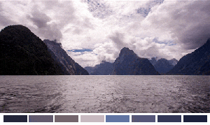
Image source: Building a Color Palette In Your Film - Filmmakers Academy

Image source: How to Use Color in Film: 50+ Examples of Movie …
To build a color palette for a film, start with the emotion and story first, then choose colors that support that tone. A strong palette is less about picking attractive hues and more about creating visual meaning that stays consistent across wardrobe, production design, lighting, and color grade.
1. Define the genre and emotional tone
Color works best when it reinforces what the scene is already doing dramatically. A thriller may lean into high-contrast blues, sickly greens, and harsh whites; a romance may use warm ambers, soft pinks, and gentle separation between subject and background. The same color can change meaning depending on context: red can feel romantic, violent, warning-like, or ceremonial.
Common cinematic associations include:
- Red → tension, passion, danger
- Yellow/orange → hope, warmth, excitement
- Blue → calm, sadness, coldness
- Green → nature, unease, mystery
These associations are not rules, but they are reliable starting points. The more specific the emotional goal, the easier it becomes to narrow the palette.
2. Choose a color structure
Most film palettes work best when they are built from a limited structure rather than a random collection of favorite colors. Restricting the palette gives the image identity and helps every department work from the same visual logic.
Common cinematic schemes include:
| Scheme | How it works | Example |
|---|---|---|
| Base + Secondary + Accent | 3 colors: dominant, supporting, pop | The Grand Budapest Hotel: pink + red + gold 1 |
| Complementary | Opposite colors on wheel (e.g., teal & orange) | Most popular for skin tones 2 |
| Analogous | Colors next to each other (harmonious) | Balanced, nuanced scenes 2 |
| Monochrome | One dominant hue with tone variations | Hero 2 |
| Pastel | Washed-out, milky, soft | Wes Anderson films 2 |
| Muted | Desaturated, bleak | Roy Andersson films 2 |
A base-plus-accent approach is often the most practical. It allows enough variation for production design and costumes while still keeping the frame controlled. Complementary palettes can create energy and separation, but they need careful exposure and skin-tone management so the image does not feel overprocessed.
3. Match palette to character arcs
A palette becomes more effective when it changes with the story. Character progression can be shown through color movement: a world may begin restrained and desaturated, then gradually open into warmer or brighter tones as a character gains confidence, hope, or clarity.
This can happen in subtle ways:
- wardrobe shifting from gray and brown into more saturated colors
- lighting changing from cool top-light to warmer side-light
- set dressing introducing stronger accent colors as the story progresses
- backgrounds becoming visually busier or quieter depending on the arc
In Joker, color helps track psychological decline and social isolation, with shifts in tone and saturation reinforcing the character’s descent 1. The key is consistency: if the palette changes, it should change for a reason tied to the narrative.
4. Make the palette consistent across departments
A film palette is not only a grading choice. It should inform wardrobe, lighting, props, locations, and set decoration from the earliest planning stages 3, 1. If one department treats the palette as optional, the result often becomes visually fragmented, and the grade ends up fighting the image instead of supporting it.
A useful division of labor looks like this:
- Director sets the overall visual intention, such as “cold blue with warm practicals.”
- Art and costume designers choose materials and colors that fit the palette.
- Cinematographer shapes light so the chosen colors read clearly in frame.
- Colorist fine-tunes contrast, saturation, and balance in post to preserve the intended look 3
This process is especially important when skin tone, practical lighting, and production design all share the frame. A palette that looks good on a swatch board can fail on set if it conflicts with faces, mixed lighting, or reflective surfaces.
5. Study references with intent
Looking at films stills is useful only when the reference is analyzed for structure, not copied as decoration. The important questions are: Which color is dominant? Where is the accent color placed? Is the image warm overall, or are warm elements isolated against a cool field? Are the shadows neutral, colored, or crushed?
Helpful tools and habits include:
- building palettes from stills and frame grabs
- comparing daylight scenes to interior scenes in the same film
- studying how color changes between wide shots and close-ups
- noting how saturation behaves in highlights versus shadows
The goal is not to imitate a famous look exactly. The goal is to understand why it works so that a similar logic can be adapted to a different story, location, or budget.
6. Build a color script
A color script is a scene-by-scene map of how color changes over the runtime of the film. It is especially useful in preproduction because it turns broad ideas like “darker halfway through” into practical choices that can be planned in advance.
A color script can track:
- dominant hue in each sequence
- saturation level by act or chapter
- warm-to-cool progression
- emotional turning points where the palette shifts
This is one of the most effective ways to avoid accidental inconsistency. If the opening section is meant to feel fragile and intimate, and the ending is meant to feel exposed and stark, the script can show where those transitions need to begin visually long before the grade.
Common mistakes to avoid
The most common mistake is using too many colors without a hierarchy. A frame with equal-strength reds, blues, greens, and yellows can feel noisy unless the story specifically calls for chaos. Another common problem is choosing a palette that looks good in isolation but fights the subject, especially skin tones and practical lighting.
Other pitfalls include:
- relying on post-production to “fix” an unfocused palette
- using saturation too aggressively, which can make shadows muddy and highlights artificial
- ignoring the texture of the location, costume fabrics, and skin
- changing hues without tracking the story logic
- using trendy looks, such as teal and orange, without adapting them to the material
A practical workflow
A clean workflow for building a palette usually follows this order:
- Define the emotional goal of the film.
- Select a limited color structure.
- Assign roles to colors: dominant, secondary, accent.
- Test the palette in wardrobe, props, and lighting.
- Create a color script for the full story.
- Refine the grade so it supports the planned look instead of inventing one late.
That approach keeps the palette tied to story, performance, and production reality. It also makes collaboration easier, because every department can read the same visual plan instead of interpreting “style” in different ways.
The best film palettes are simple, deliberate, and repeatable. They do not cover every possible color; they choose a few and use them with discipline.
References
-
🎬 Color Palettes in Film EXPLAINED! 🎨 How to Make Your Film Visually Iconic
-
10 Colour Palettes to give your video a filmic look - Aspect